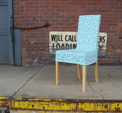
Letters are written with portrait orientation. Magazines are pages and pages of portraits. People are usually vertical when we are interacting with them. "Why," many of us ask, does Etsy insist on landscape orientation for our product photos? It's a bit of a burden for those of us in fashion. It's an adjustment for anyone new to Etsy. We just don't think in terms of landscape. And it is hard work to bend your leggy model like gumby to fit into a wide frame. Why can't I just let her stand there and look beautiful? I think the real answer is that they just weren't thinking when they designed the site layout. The fantasy answer is much more fun and useful for me. Perhaps landscapes make us linger.
A landscape view is sexy.
With a landscape view, online shoppers see more of your shop on every page.
Our computer screens are landscape (this is probably the source of the real answer,) so we need to adjust and make the best of it.
This is how I crop and size my photos so there are no surprises when I see them in my Etsy shop:
If your subject is vertical and you want to capture the whole subject, your first option is to shoot in landscape, farther away than usual, and leave room on the sides for an interesting background.

The perfect sizing for Etsy is 1000 pixels wide by 800 pixels tall. If your original is too small for that, 750 wide by 600 tall also works.
If you do want to upload a vertical shot to Etsy, just know it will get cropped into these proportions - the width will remain untouched and the height will get cropped to width divided by 1.25. The crop will be centered. So I uploaded another version of the photo at the top of this article, and on Etsy it looks like this:
The bottom line is that if you want to make sales online, the most important thing is your presentation. You can have the most gorgeous product in person, but if your photos don't look as good as the real thing, they will not sell. I hope this article helps you frame every product shot like a work of art.

4 comments:
Wonderful clarification!
Thanks! I am always trying to get my photos center framed within the Etsy framework.
SO true! Very helpful post for anyone starting out on Etsy. Finding a nice background worth having in the pic is sometimes better than it would've been if etsy was set up for vertical shots.
Thanks for sharing.
Happy holidays
Mary Rose
www.thecityfolklore.blogspot.com
at least Etsy doesn't require all of our images to be perfect squares! That would be even more of a challenge, I think.
Post a Comment